PAUL HARTMANN, a global leader in medical products and services, includes brands like Sterillium disinfectant in its portfolio. Ray Sono took on the role of the Digital Lead Agency, supporting the client across a variety of digital projects, such as the corporate website, app design, consulting services, explainer videos, and more.
Challenge
A consistent multi-channel design language & experience
Paul Hartmann operates across various fields, both online and offline. A coherent and impactful digital branding strategy had to be developed, placing the user at the center. The challenge was to ensure that the design not only aligned with the company's diverse sectors but also provided a seamless and engaging experience across all touchpoints.
Professionalizing the digital presence
Over the course of 4 years, I managed a variety of projects and served as the main point of contact and advisor for various products and strategies. This included the initial tool evaluation, the setup of a Figma structure, the creation of design systems, an app guideline, several motion design projects and the relaunch of the corporate website content.
Created 2019-2023 at Ray Sono
Fields of activity
l
Creative Direction
l
Digital branding
l
Design system conception & creation
l
Service & product design
l
Creative concept
l
Motion design
My role
As Design Lead with a focus on web and app-based applications, I was responsible for the project-specific management of design teams. In addition to visual direction, my role included a strong conceptual component within the consulting process. I acted as one of the main points of contact for the client and supported the ongoing development of digital products in an advisory capacity. I also held a cross-team role aimed at shaping efficient design processes. Close coordination with the technical service provider was a key part of the workflow.


Web
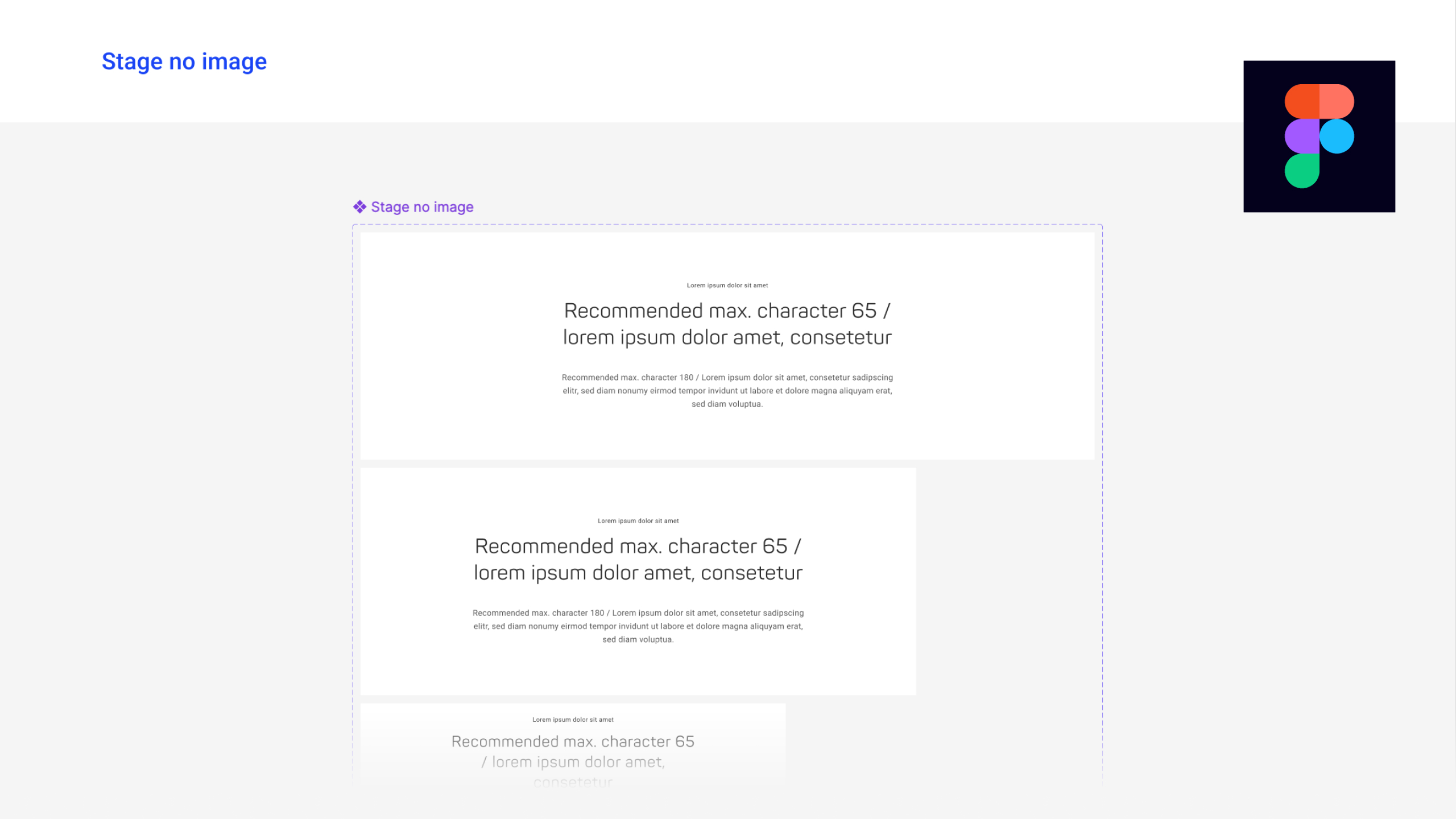
Introduction of a standardized design – Via a design system & invention of the necessary processes for design operations
The experience and design of the global HARTMANN website was a system that had grown over the years and was initially invented by development.
The major task was therefore to create a new standardized source for this, which could be used and further expanded by users/designers within a design tool (Figma).
The starting point was the recently completed relaunch of the corporate identity, which mainly involved dealing with the logo, colors and the new ellipse symbol. The live status of the development at that time served as a jumping-off point for a newly created design system, with scope for slight improvements in the individual new components.
The starting point in 2018
The status in 2022 - with a design system and the necessary design operations processes
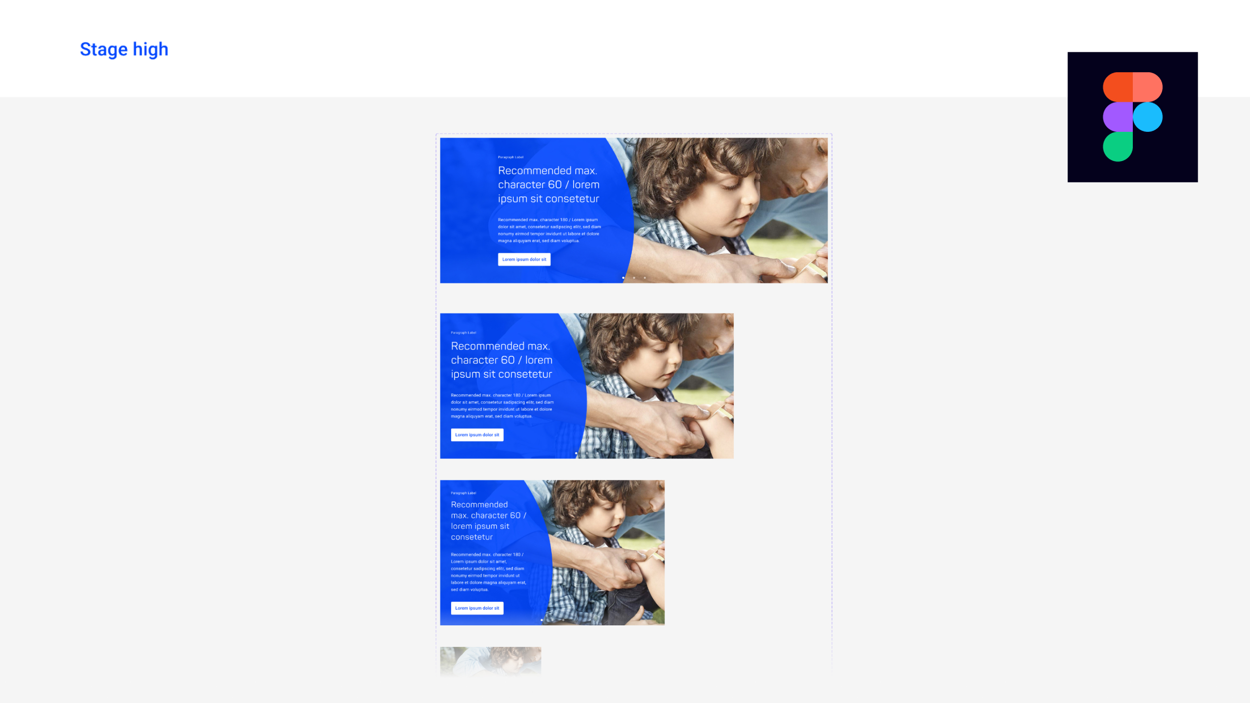
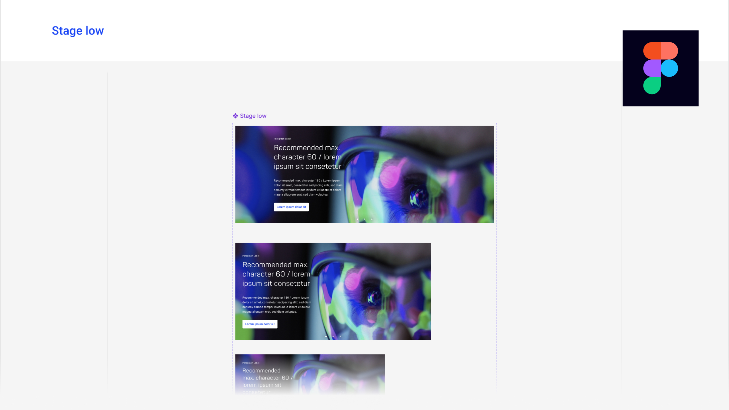
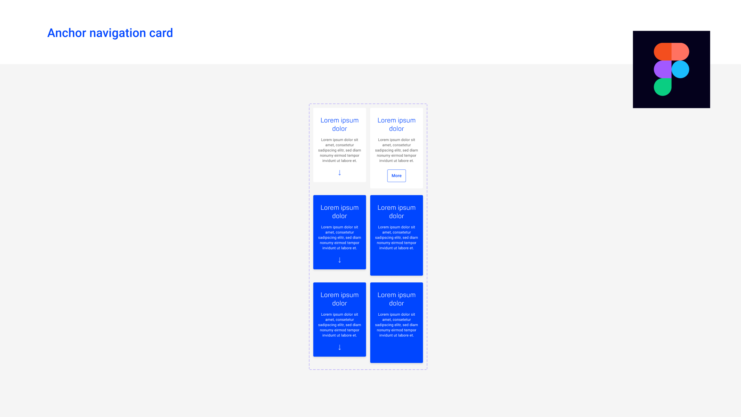
The initial design system
The most important and most frequently used components were integrated into a newly created design system. All in responsive functionality designed for 4 breakpoints (from desktop to smartphone).
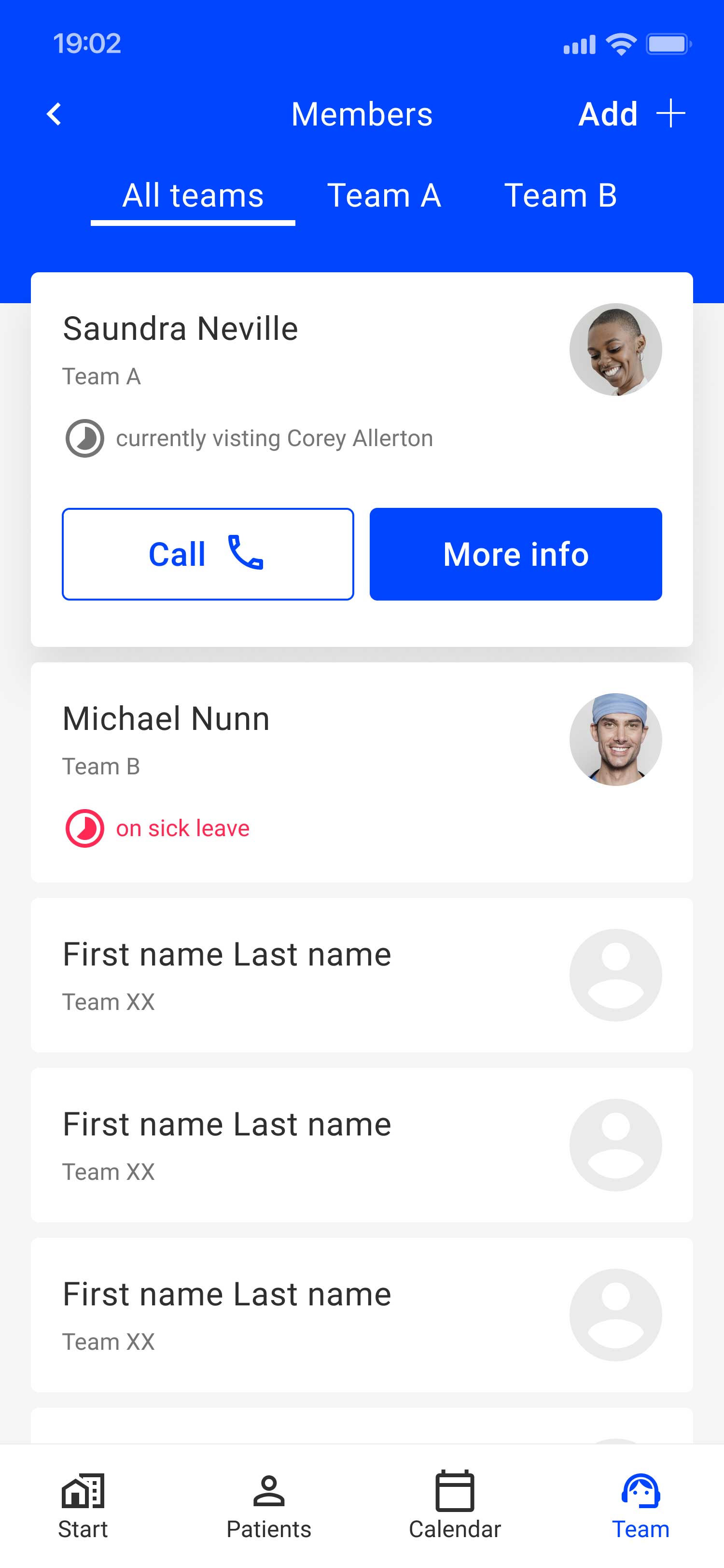
App
Design guideline
A conceptual and design foundation/guideline was created to serve as a reference for partners implementing specific app projects.


Motion
New illustrative & lively face for HARTMANN
Over the course of time, several motion projects have been implemented, each with a focus on new illustrative design, which was created by Ray Sono as part of the HARTMANN rebranding.
New corporate.hartmann
Outsourcing of corporate content - digital speedboat as POC
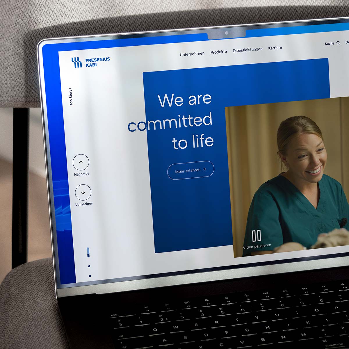
The coporate content of the global website was to be outsourced to a separate URL. This project was set up as a POC, so to speak, in order to manage the necessary processes and implementations in a relatively short period of time and served as a blueprint for the planned major relaunch of the entire global website.
See the description in a separate project: